"...A silent movie actor who doesn't want to hear anything about the talkies...young starlet and the crossed destinies...everything fell into place and made sense, even the themes €“ pride, fame, vanity...an old-fashioned vision of love, very pure, that also held with the form....the silent movies that have withstood the test of time...simple love stories that are accomplished films, even masterpieces...everything, but lighter, more optimistic, more joyful, despite everything..."
- Director Michel Hazanavicius
The golden age of Hollywood comes to life in black and white in THE ARTIST, a paean to the place of dreams and filmmaking. French Director Michel Hazanavicius talks with SET DECOR about the making of this silent movie tribute to Hollywood.
What was your process in terms of the set decoration? Did you have specific pieces in mind for the sets? Did you have Production Designer Larry Bennett and Set Decorator Bob Gould bring pieces in for selection?
Well, my main concern, of course, was to tell the story. I didn't try to make nice images...I tried to make accurate images. And to be accurate, they had to make sense. So my concern was to tell the story with images that make sense to tell the story.
In this film, the picture is paramount, every element says something.
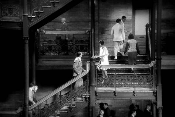
I tried to work with motifs, like the stairs, because the story is about an actor who is going to fall and an actress who is going to rise up. She's the future. He's the past. So I wanted him to go down all the time, with the stairs always, but also with the quicksand, for example. He is always going down and she is always going up...always. I think when you have that kind of a motif, it gives you some accurate images.
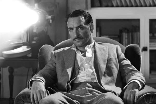
The surface of the image is important. So I tried to work a lot with shadows, or with mirrors...and we used photos of the actors, posters of the actors, movies of the actors, paintings of the actors. It's always about his representation. So you have a lot of his shadow...you have these representations of him all through the movie. And the bright images of her.
The contrast is another example. When the characters are at their top, there is a lot of contrast. They have presence and they are strong in the image because of that contrast...the black tuxedo with the white shirt... And when he falls, he becomes more gray, and the background is gray, so he is like fading into the frame and he is weaker.
When we find him in 1931, two years after he was a big star, now he's a common person. I had the costume designer make his costume two sizes larger, so you have the feeling that the character shrinks a little bit. What I tried to do was to make sense in everything and I think that gives a lot of the accuracy to the images.
So, too, with the sets. His house in the beginning is very formal and stronger on the blacks and whites, and then later his apartment is, as you say more in the grays...
Yes, exactly. And the movie sets on the soundstages where they are filming are almost shining, with strong blacks and very much contrast, because this is the famous place and that's where they want to be. And then the final sequence, the dancing sequence, is really pure black and white. And so the decoration participates all through the film.
For the period aspect - this is my third period movie - what I tried to do for each of them was to be accurate to that period's style of filming. Usually for a period movie, the directors re-create what they are shooting, but they do not re-create the way to shoot it. So they can, for example, use a steadicam to shoot a character from the 1940s. I don't do that, because I think the shot will not be accurate, because you have never seen someone in the 1940s shot with a steadicam. I don't want to do it. I understand that is another way to shoot it. But I don't want to do it. So that participates also to the accuracy.
And the other thing is...I always think that the less you do, the better it is. So I spend a lot of time on set to pull out of the frame a lot of detail...small things, and everything, really...because I think people don't need that. If you let the audience, they will do the job - they will do it with their own imagination. And also, if your actors are good, and if they are telling you a good story, you don't want the background to be too strong in the frame.
To take all the attention?>
Exactly. You have to have some kind of priority in the frame, so that's the way I try to organize the images.
Part of the job of set decoration is to give clues to character, therefore elements in the background or foreground might tell you something about the character's personality or history. You have edited these back, so the clues are still there, but not the layer upon layer that is so popular today. You've edited down to give the essence of it.
Yes, exactly. That's why I pull out of the frame a lot of things, always. You can have a 1920's trophy with a horse, for example, but why, actually? Why have a trophy with a horse? And the spectator [audience] will say, "Why is there a trophy with a horse?" So I pull it out.
...Especially when you don't have dialogue, because only images are telling the story. So everything has to makes sense, to need to be there. So I had to be very selective with what was in every shot.
I'm convinced that people don't need all that extra. It's like a sentence...you don't have to say the same thing many, many times. I mean, some things you have to tell them once, some other things you have to tell them twice. But not 11 times. It's the same with visuals. You have to be elegant and you have to be accurate with what you are referring to, but you have to tell your own story. And you don't have to make things confusing for the audience. You have to make things clear for the audience.
So that's what usually I try to do...even when I'm doing talking movies. For example, when you are working on the sound, usually the sound designer will put in a lot of sounds. If there is a bird in the sky, they always put the sound of a bird. And it is always a battle, because I say, "But all the birds are not shouting. You can see a bird and not hear it." That's important. We don't need all the sounds. We have to select things and keep just the sound that makes sense. The same applies visually with the sets.
You don't want to be disturbed by useless information. You want good information - especially in the silent movie, because the story is very fragile and it has to be very precise.
So it's like in real life, the way we look at things, the way we hear things, we make selections. All of the time, we make selections. When we look at someone, for example, what we really have in our view field is 1000 pieces of information, but what we see is the person...well, we see what we want to see and we hear what we want to hear. So my job as a director is to organize the vision of the audience to be able to follow the story as simply as possible.
So there was quite a process of selection, a continuous process of bringing things in, changing them out and bringing something else?
Yes, yes! Sorry, it was very difficult for the production designer and the set decorator, because in a way they could not be aware of what was in my head, so I had to make the vision and I had to select it. I had to make the frame with what they brought to me, so it was not an easy job for them.
Did you end up with a favorite piece? Or one that was particularly symbolic for you?
I kept the painting of George. Because, since I was a kid, I remember I was like ten years old when I saw LAURA, the Otto Preminger film, and every time I saw that movie subsequently, I would think to myself, "Where is this painting now? Who got the painting?" And every time I see a movie, a classical movie, with a painting of an actor, I wonder "Where is the painting...what did they do with the painting?" So this movie, I had a painting and I kept it for me!
You mentioned using the representations of the characters, from this painting, for example, to mirrors and shadows, shapes and silhouettes - simple things, but effective.
When I was a student, I went to an art school, not a school for cinema. So I like to compose the frames of the movie. I like to define each. I storyboarded everything. I had to know that everything was understandable. I like each shot to have meaning...to play with contrasts, shadows, place them in the frames and find a visual writing, codes, meanings... I love it!
For this one, I wanted the shadows in the frame, especially for the close-ups, because there's the character and his representation, always. I asked the cinematographer and the production designer - I mean, you can't separate the production designer from the cinematographer, and they did an amazing job - but I kept saying to them, "I want a single shadow. I want sharp shadows."
It's the vocabulary of that period. It's the grammar of that kind of cinema. So it was really pleasant to do it. I really enjoyed working in that style.
It's a black and white movie, but you shot in color. Did you create a color scale that showed the conversant grays? How did you deal with set pieces that to the naked eye were different colors that might not work together in color, but did when translated as grays?
We always talk about black & white, but it really is about the gray. All of the nuances of gray.We made a lot of tests...7 or 8 camera tests. And everyone wanted to be sure. I mean, the costume designer asked me to swear that there will never be any color version of the movie! Because, if I have this yellow dress and this purple jacket and if it is color version, it's a catastrophe. And so there won't be any color version.
We also had a color sampler and we knew how they would react. And, something very simple, we had the video monitor on set and it was in black and white, so I had an idea of what we were getting. But the costume designer, the production designer and the set decorator, they really did a great preparation. We didn't have any surprises on the sets.
And you were able to film a silent movie about Hollywood in Hollywood...
Yes! When we were scouting for locations, it was really incredible for me, because when you love movies and when you love Hollywood, it was the best tour possible! We've been to so many places, historical places, like Harry Kohn's office, Charlie Chaplin's office, Charlie Chaplin's studio, the Max Sennett Studio. We filmed at Paramount and Red Studios [formerly Renmar] and at Warner Bros.
Peppy'shouse in the film, that's Mary Pickford's house...the bed where George wakes up, that's Mary Pickford's bed. We were in truly mythical places. Even the theaters where we shot, the Orpheum and the Los Angeles Theater downtown ...Charlie Chaplin made the premiere of MODERN TIMES with Albert Einstein...I mean it was crazy to be there.
People think of silent movies as old, but the format is still modern. They are the purest way to tell a story...images tell the story.
|